You can use question compare to see how the respondents to a question also answered any other question in our system. A chi-squared test is performed on each table to determine statistical significance, and cells with highlighted green or red percentage values indicate where the InsightStore has identified statistically meaningful differences.

To access question compare, go to the question page. Under the results graph, you’ll see Results and Settings. Click on Results, then Compare.
On the question compare screen, you can sort the list of questions by Strength of Association, Newest First, or Most Responses First. You may also search for questions with or without applying any filters. You can access the same filters as those used on the main list of questions.
To see how the respondents answered a question, click on the expanding caret to the right of the word Action column.

Display Modes
You may display the comparison as a Compare Table or a Stacked Bar Chart.
Note: Switching from one Display Mode to another can take several seconds. Please be patient.
Understanding the Compare Table Display Mode
Here’s an example of a Compare Table:

The compare table display mode shows a table that contains the first question answer options listed in rows and the second question answer options in columns.
Each row and column will have the total number of respondents, as well as the percentage share of those respondents. Each cell in the table will include the share of respondents in that row and that column. If the number of respondents is substantially different than expected in that cell or the questions are not correlated, the system will include green or red indicators of those differences.
Below the table, use checkboxes to control which information to show in the table. There are checkboxes for the Row %, Column %, and % from Expected.
Flip Axes
If you want to exchange the values on the x and y axes, use the button at the lower left corner of the compare table.

I used the flip axes button, and now I see this Compare Table:

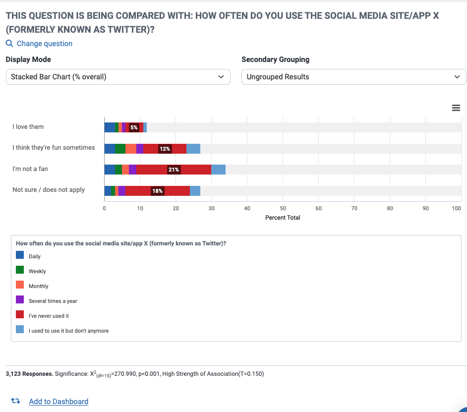
Understanding the Stacked Bar Chart Display Mode
The Stacked Bar Chart Display Mode shows a diagram that contains a stacked chart for each of the answers to the first question, with each stacked chart containing the answers to the second question. There’s a color key below the graph for the second question’s answers.
Understanding the Strength of Association Calculation
The InsightStore contains many questions. To aid with finding out which pairs of questions have a strong association, the InsightStore is constantly crawling the question library and measuring the strength of association between pairs of questions. The strength of association is measured in terms of Tschuprow’s T coefficient (see statistical definition below).
Once the T is calculated, it will be shown in the search list of questions to provide a visual indication of questions that are likely to be of interest to researchers.
Since having a high strength of association provides a very significant cue for zooming in on interesting questions to compare against, the system provides a sort by unweighted strength of association option. That is the default search option.
The discovery of the strength of association takes into consideration the weighting scheme. Depending on your account configurations, the system will crawl for the strength of associations for various sets of weighting schemes.
Notice that sometimes, the system does not show a T coefficient. That happens when the system has not yet calculated the T between that pair of questions or when there are not enough answers in one of the questions in the pair to allow for a calculation. Because of that, you should be aware that sometimes there are questions that may have a higher T coefficient than the ones that have been calculated.
CivicScience advises the following characterizations of various levels of the T statistic:
- T < 0.05: Low strength of association
- 0.05 <= T < 0.10: Medium strength of association
- 0.10 <= T < 0.20: High strength of association
Answer Groupings
Question compare works well with answer groupings. For the first question, you can pick an answer grouping on the top results pane. For the second question, if it contains answer groupings, the system will show a dropdown where you can select the answer grouping to show.
Once you make answer grouping selections, the system will update the whole comparison table immediately, including the chi-squared test and significance.
Using answer groupings in combination with question compare is very powerful. For instance, if a question has many possible answer options, the correlations may be challenging to see. Say a question has “I like it” and “I love it” answer options. The comparison table may not show that they are statistically significant when examined independently. But if you group them in an answer group, they may be statistically significant.
Scores
Question compare also works well with scores. You can only select a score for the first question, though. You do so by choosing a score on the display options of the top results pane. You can select answer groupings for the second question, though, if it has any answer groupings configured.
Once you select a score, the system will update the whole comparison table immediately. There will be only one line in the table showing the score for each possible answer option (or answer grouping) of the second question.
Statistical Terms Used in Question Compare
- Chi-square: The chi-squared value results from Pearson’s chi-squared test of independence, which evaluates whether a relationship exists between how the respondents answered each question.
- P-value: The p-value corresponds to the chi-squared value and represents the probability of no relationship between how respondents have answered each question. The lower the p-value, the more confident we can be that such a relationship exists. Results shown to be statistically significant have been adjusted according to the Benjamini-Hochberg false discovery rate procedure.
- Tschuprow’s T: Tschuprow’s (sometimes spelled Chuprov’s) T is a measure of the strength of the relationship between how the respondents answered each question. Its value ranges from 0 to 1 -- the higher the value for Tschuprow’s T, the stronger the relationship between how the respondents answered each question.